Jason Guevara
Last updated November 2022
Jason Guevara
Last updated November 2022
UserTesting makes it easy to run remote usability tests and synthesize useful insights from results. A commonly used question type, verbal responses, resulted in a video per participant you would have to watch in order to evaluate for insights. This was a very manual and time-consuming process. My team set out to build a feature that would allow customers to increase their speed to insight through data visualizations aimed at identifying outlier responses.
Responsible for collaborating on research, product strategy, and end-to-end design for keyword maps.
Lead designer with input from the wider design team, 1 Content Designer, 1 Product Manager, 1 Researcher, and 4 Engineers.
🔮 This is a simplified overview. To learn more,
get in touch →
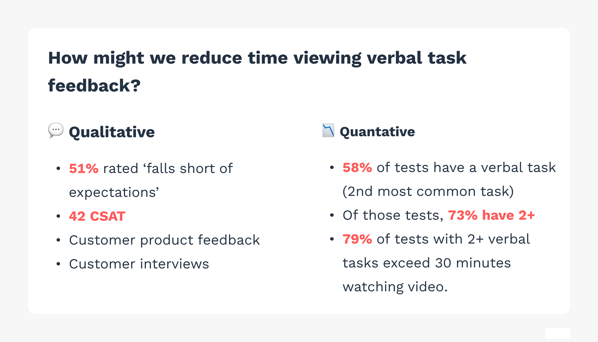
We knew that when it came to efficiency in speed to insight, verbal responses ranked the lowest of all task types. 51% of customers rated verbal task output as 'falls short of expectations.' The aggregate CSAT score was 42. Additionally, we worked with the customer success team to see the number of customer feedback requests for a better version of verbal tasks was sorely needed.
Quantitately, we knew the problem was widespread because 58% of tests have a verbal task in the test plan. This makes it the 2nd most commonly used task type. Of the tests that have verbal tasks, 73% have two or more. Of those tests who have two or more, video output from these tasks require in excess of 30 minutes to glean insights. This fell below what we know was the optimal time spent watching video.
Qualitative and quantitative indicators to the problem.
First we made sure we understood what success looked like for this project. Our North Star metric was to increase the percentage of tests that require >30m to synthesize. A more direct proxy metric involved reducing the amount of time spent viewing video generated from verbal tasks.
I had make a few considerations as we began. We knew we didn't have any systemized data visualizations. This meant we had to build these from scratch which meant tons of lead time for the engineers. The design phase had to move quickly. The company was also internationalizing the platform which meant we had to consider how this experience would look in German.
Keeping all of the goals and context in mind, I set out to iterate quickly by running concept validation tests early and often.
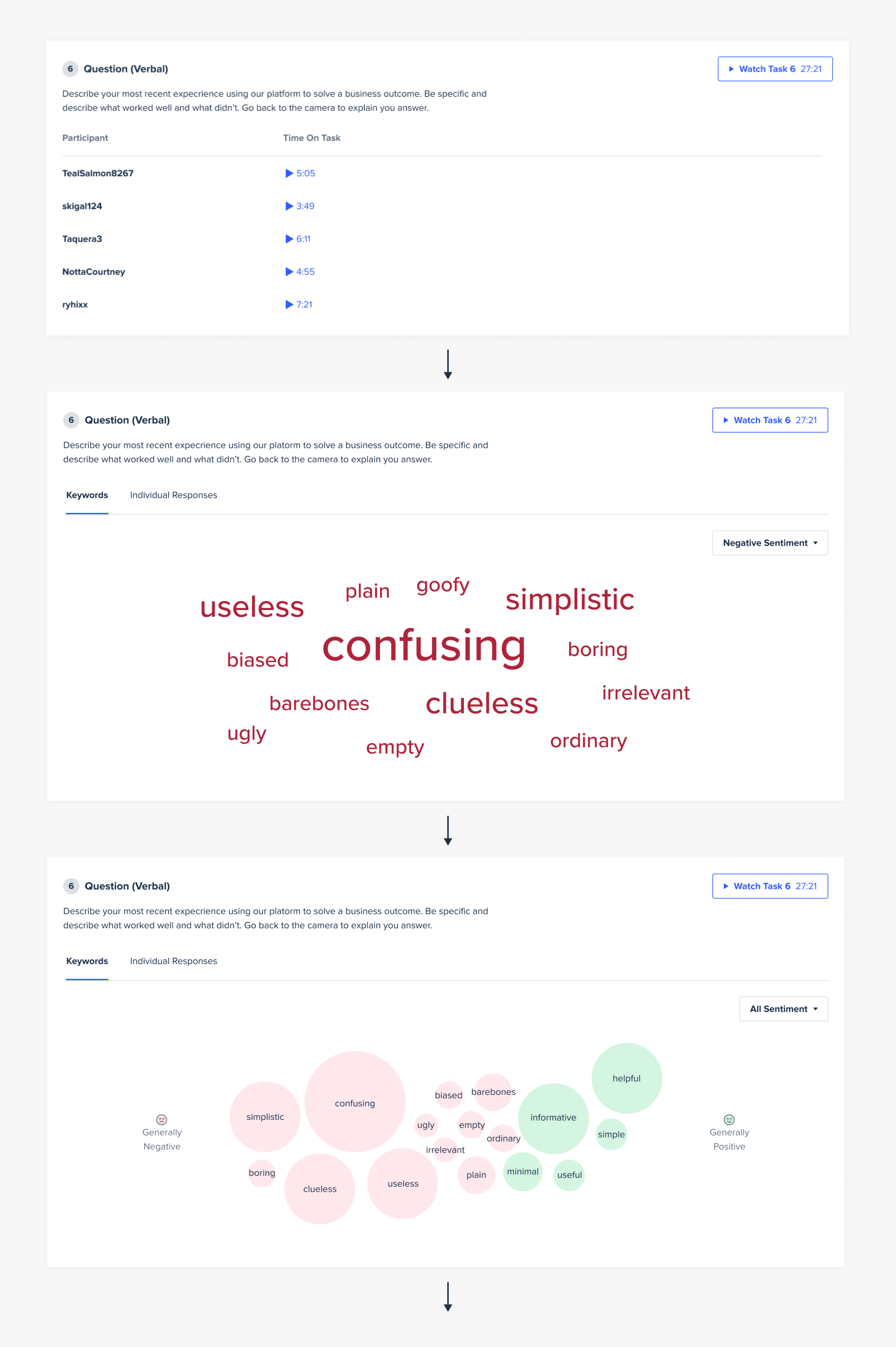
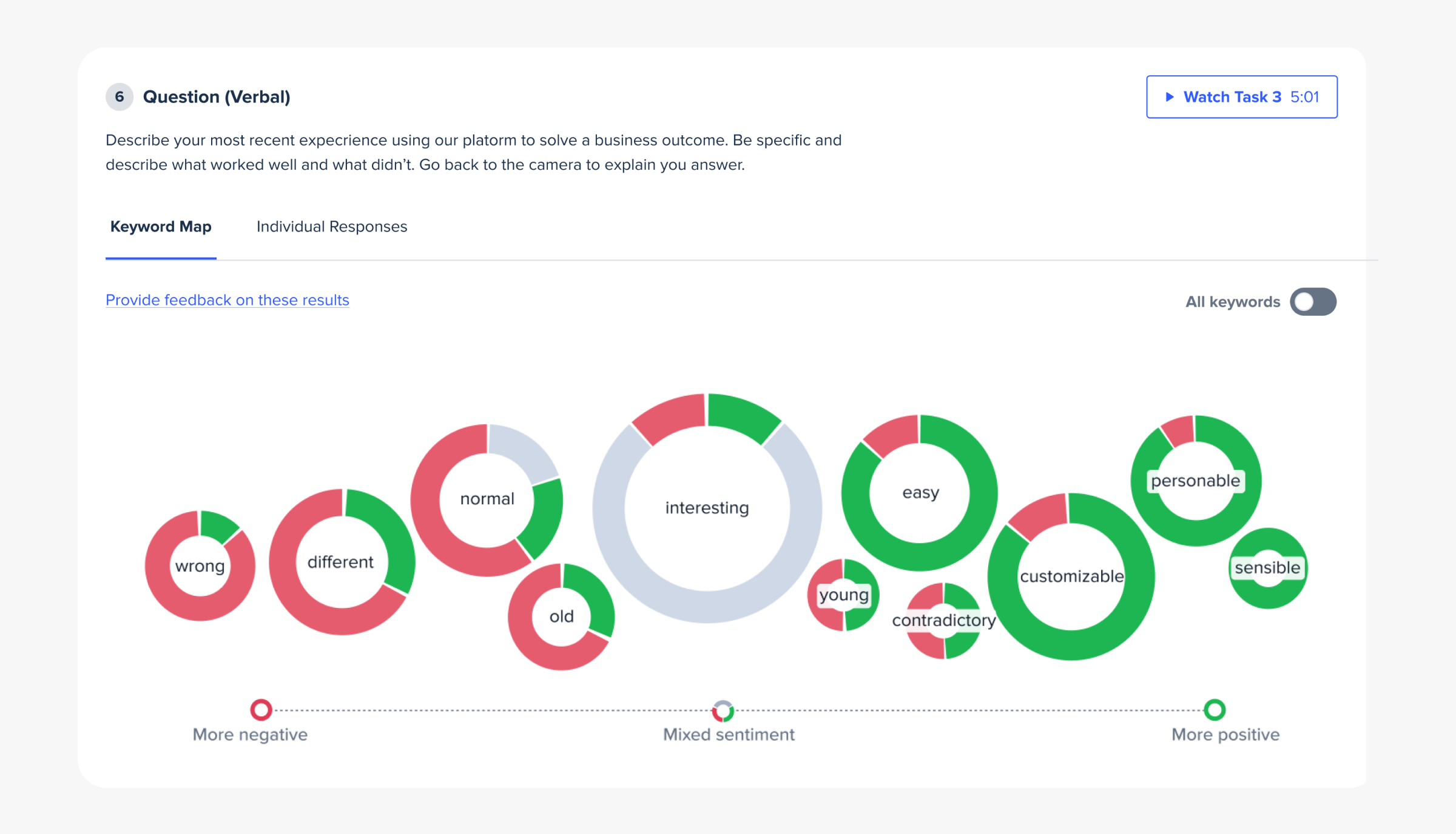
Iterations of the data visualizations for keyword maps.
An aspect of this feature I wasn't expecting would create much controversy was how we would communicate neutrality. We knew we wanted to utilize a vector of sentiment to help customers identify intersting results. There was already a color system in place in which a shade of purple was used to indicate neutral sentiment. Once I began mocking concepts, this color seemed off and user tests confirmed this for me.
I was inclined to use a yellow or gray especially since sentiment was going to be plotted along an axis from negative to positive. Both of these color options resulted in improved customer understanding while analyzing results.
This pit my opinion against an existing system and internal stakeholders who were partial to the existing purple for various reasons. Also, the video player experience which lived one click away from the keyword map feature used purpose for neutral or no sentiment responses.
Ultimately, the user testing responses were too clear of an indicator that using purple would've put the success of our efforts at risk. So, we proposed officially using gray in the instances when sentiment is shown on an axis relative to itself.
Once we shipped this experience, we quickly saw promising results. Over the first 30 days, the number of tests that required >30 minutes to analyze increased by 13%. More direclty, the time people took to review verbal task video was reduced by 21%.
The customer feedback we saw further built on the success of our efforts. It was reward to see how impactful these changes were for the success of our customers.
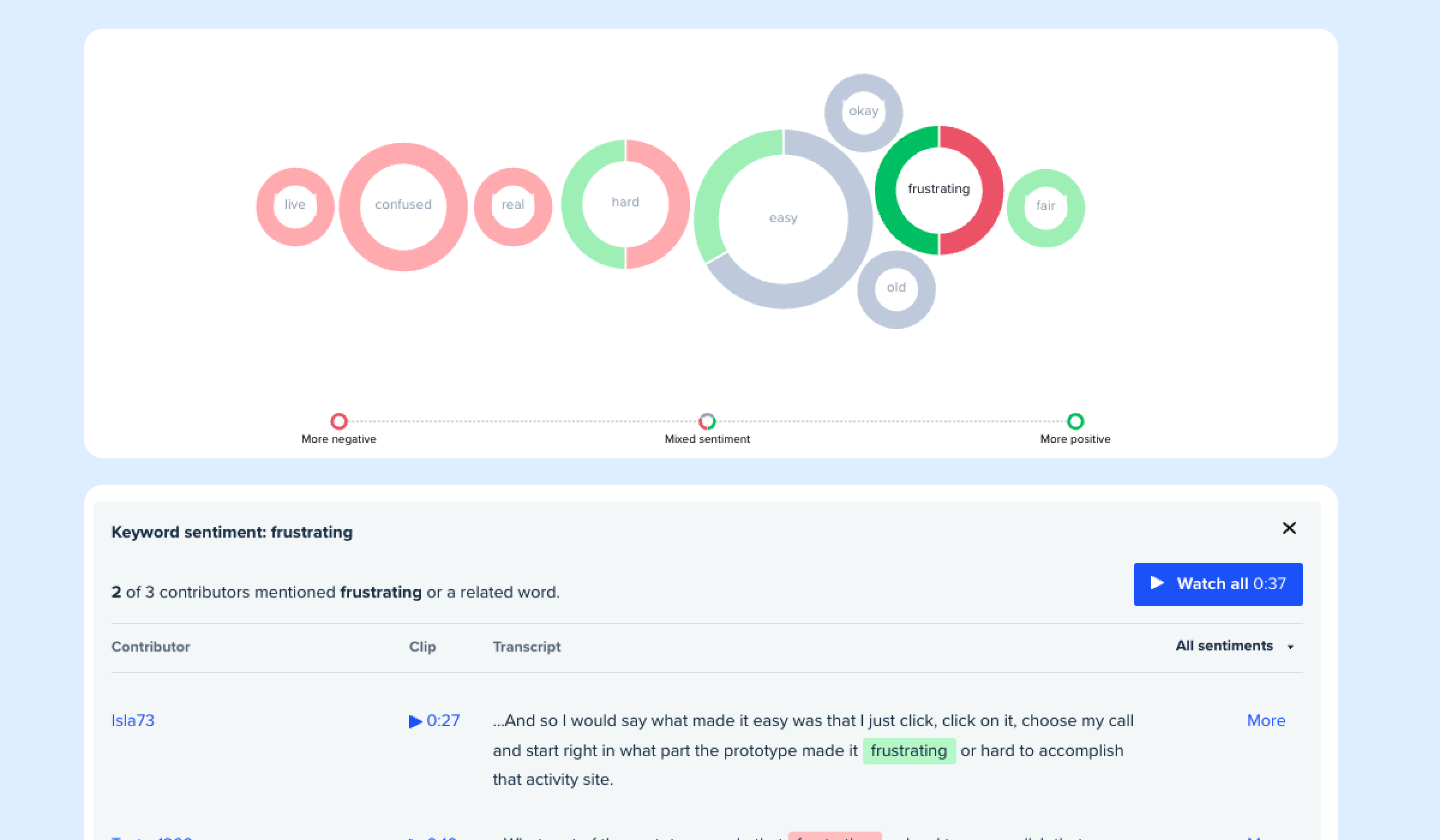
Continued refinements around the data visualizations were made and we eventually landed on a pie chart per node to provide the most efficient way to communicate levels of sentiment and related words.
The current state of keyword maps.